
Context
Spotify launched a new playlist sharing feature that lets users send curated playlists to other users, either in-app or via external channels (iMessage, Instagram Stories, etc.). As a Product Analyst, I was asked: how do we know if this feature is actually working?
This case study walks through the measurement framework I'd build, a mock rollout dataset, and the resulting analysis and recommendation.
Feature goals
- → Increase user interaction and engagement
- → Drive music discovery
- → Strengthen retention and community
North Star Metric
"Share-to-Listen Rate — the % of shared playlists where the recipient streams at least 30 seconds of the playlist within 7 days of receiving it."
Why this North Star
With ten-plus candidate metrics on the table, the first job is picking one number the whole team optimizes for — everything else becomes supporting or diagnostic.
Why this one over 'playlists shared' or 'unique sharers': those measure sending behavior, which is easy to inflate (spam, one-off curiosity) and doesn't prove the feature delivers on its actual goal — getting music in front of new ears. Share-to-Listen Rate captures the full loop: someone shared something, and someone else valued it enough to listen.
Supporting Metrics Framework
Every North Star needs diagnostic metrics underneath it so a single number never hides what's actually happening.
| Question | Metric | Definition |
|---|---|---|
| Is it discoverable & used as intended? | Unique sharers, shares per sharer | # distinct users who share ≥1 playlist / week; shares ÷ unique sharers |
| Is usage growing? | WoW growth in shares | (This week's shares − last week's) ÷ last week's, tracked against rollout % |
| What drives usage? | Share mix by genre/mood/segment | % of total shares by playlist category, user cohort (new/power user) |
| Does it drive discovery? | New-artist streams from shared playlists | Streams of an artist the recipient hadn't played in the last 90 days, sourced from a shared playlist |
| Does it drive engagement? | Share-to-Listen Rate (North Star), likes/follows/comments | See North Star definition above |
| Does it drive retention? | 28-day retention, sharer vs. non-sharer (within an A/B test) | See Retention section — this is the metric most prone to false conclusions |
Is it discoverable & used as intended?
- Metric
- Unique sharers, shares per sharer
- Definition
- # distinct users who share ≥1 playlist / week; shares ÷ unique sharers
Is usage growing?
- Metric
- WoW growth in shares
- Definition
- (This week's shares − last week's) ÷ last week's, tracked against rollout %
What drives usage?
- Metric
- Share mix by genre/mood/segment
- Definition
- % of total shares by playlist category, user cohort (new/power user)
Does it drive discovery?
- Metric
- New-artist streams from shared playlists
- Definition
- Streams of an artist the recipient hadn't played in the last 90 days, sourced from a shared playlist
Does it drive engagement?
- Metric
- Share-to-Listen Rate (North Star), likes/follows/comments
- Definition
- See North Star definition above
Does it drive retention?
- Metric
- 28-day retention, sharer vs. non-sharer (within an A/B test)
- Definition
- See Retention section — this is the metric most prone to false conclusions
Guardrail metrics
Growth metrics alone can hide harm. I'd track these alongside the framework above:
- → Spam / report rate on shared playlists — protects against abuse of the share mechanism
- → Unfollow / mute rate after receiving a share — signals unwanted or low-quality shares
- → Opt-out rate from share notifications — signals annoyance, not just disinterest
Experiment Design
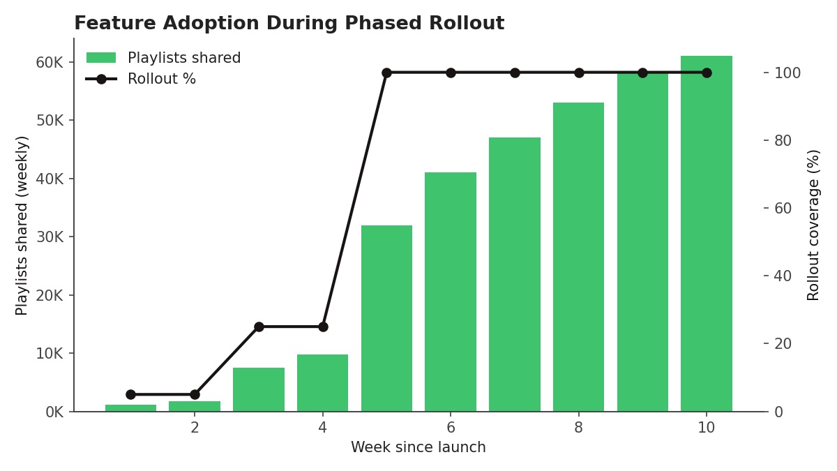
Rather than launching to 100% of users and eyeballing metrics before/after, I'd structure this as a phased rollout with a held-out control group:
- → Weeks 1–2: 5% rollout — validate the feature works, watch for bugs/spam, sanity-check event logging
- → Weeks 3–4: 25% rollout — start reading early adoption trends by segment
- → Week 5 onward: 100% rollout to treatment, with a permanent 5% control group withheld for at least one full quarter, so retention comparisons stay causally valid rather than just comparing 'engaged users who chose to share' against everyone else
Adoption during rollout
The data below is synthetic — generated to demonstrate what the analysis and readouts would look like, not real Spotify numbers.
| Week since launch | Playlists shared | Rollout % |
|---|---|---|
| 1 | 2,000 | 5% |
| 2 | 2,000 | 5% |
| 3 | 7,500 | 25% |
| 4 | 10,000 | 25% |
| 5 | 32,000 | 100% |
| 6 | 41,000 | 100% |
| 7 | 47,000 | 100% |
| 8 | 53,000 | 100% |
| 9 | 58,000 | 100% |
| 10 | 61,000 | 100% |
1
- Playlists shared
- 2,000
- Rollout %
- 5%
2
- Playlists shared
- 2,000
- Rollout %
- 5%
3
- Playlists shared
- 7,500
- Rollout %
- 25%
4
- Playlists shared
- 10,000
- Rollout %
- 25%
5
- Playlists shared
- 32,000
- Rollout %
- 100%
6
- Playlists shared
- 41,000
- Rollout %
- 100%
7
- Playlists shared
- 47,000
- Rollout %
- 100%
8
- Playlists shared
- 53,000
- Rollout %
- 100%
9
- Playlists shared
- 58,000
- Rollout %
- 100%
10
- Playlists shared
- 61,000
- Rollout %
- 100%
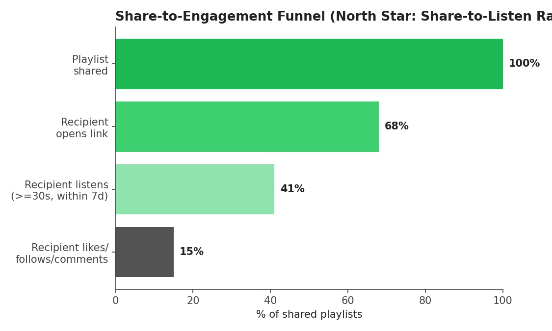
The funnel: where does engagement actually happen?
This is the view that matters more than raw share counts.
| Share-to-Engagement Funnel | % of shared playlists |
|---|---|
| Playlist shared | 100% |
| Recipient opens link | 68% |
| Recipient listens (≥30s, within 7d) | 41% |
| Recipient likes / follows / comments | 15% |
Playlist shared
- % of shared playlists
- 100%
Recipient opens link
- % of shared playlists
- 68%
Recipient listens (≥30s, within 7d)
- % of shared playlists
- 41%
Recipient likes / follows / comments
- % of shared playlists
- 15%
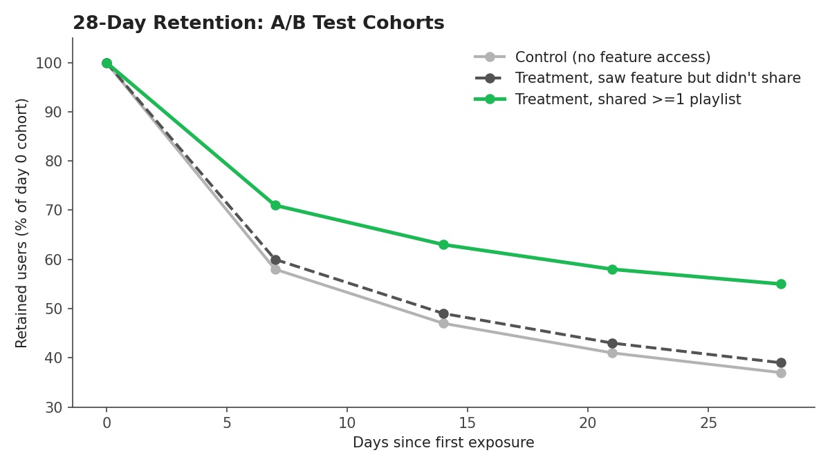
Retention: does sharing *cause* better retention, or just correlate with it?
Three cohorts, all measured from first exposure, inside a randomised A/B test.
| Days since first exposure | Control (no feature) | Saw feature, didn't share | Shared ≥1 playlist |
|---|---|---|---|
| 0 | 100 | 100 | 100 |
| 7 | 58 | 60 | 71 |
| 14 | 47 | 49 | 63 |
| 21 | 41 | 43 | 58 |
| 28 | 37 | 39 | 55 |
0
- Control (no feature)
- 100
- Saw feature, didn't share
- 100
- Shared ≥1 playlist
- 100
7
- Control (no feature)
- 58
- Saw feature, didn't share
- 60
- Shared ≥1 playlist
- 71
14
- Control (no feature)
- 47
- Saw feature, didn't share
- 49
- Shared ≥1 playlist
- 63
21
- Control (no feature)
- 41
- Saw feature, didn't share
- 43
- Shared ≥1 playlist
- 58
28
- Control (no feature)
- 37
- Saw feature, didn't share
- 39
- Shared ≥1 playlist
- 55
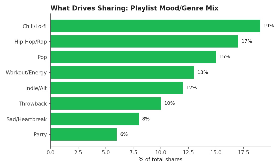
What's driving usage: content mix
Useful for prioritising: mood- and genre-based playlists are the highest-volume input if Discovery / Recommendation teams want to leverage shared-playlist signal.
| Playlist category | % of total shares |
|---|---|
| Chill / Lo-fi | 19% |
| Hip-Hop / Rap | 17% |
| Pop | 15% |
| Workout / Energy | 13% |
| Indie / Alt | 12% |
| Throwback | 10% |
| Sad / Heartbreak | 8% |
| Party | 6% |
Chill / Lo-fi
- % of total shares
- 19%
Hip-Hop / Rap
- % of total shares
- 17%
Pop
- % of total shares
- 15%
Workout / Energy
- % of total shares
- 13%
Indie / Alt
- % of total shares
- 12%
Throwback
- % of total shares
- 10%
Sad / Heartbreak
- % of total shares
- 8%
Party
- % of total shares
- 6%
Recommendation
Based on this (mock) analysis, I'd recommend:
- → Ship to 100%, keep a small permanent holdout for ongoing causal reads on retention.
- → Prioritise the open → listen funnel step (68% → 41%) — likely the single highest-leverage fix, since it's the largest drop-off after initial send.
- → Feed high-engagement shared playlists into Discover Weekly / Discovery Mix — the mood/genre segment data suggests a natural connection to existing recommendation surfaces.
- → Watch guardrails monthly, not just at launch — spam and opt-out rates tend to creep up after initial excitement fades.
What I'd do differently
- → Real data would let me check statistical significance, not just visual separation between cohorts — with mock data I can't compute a valid p-value or confidence interval.
- → I'd want novelty-effect checks: re-measure the same cohorts at day 60 and day 90 to see if the retention lift holds or fades.
- → I'd segment retention lift by user tenure (new vs. established) — sharing might matter far more for onboarding new users than for already-loyal power users.